
Programs and services can improve the customer experience by simplifying registration processes, and making webpages easier to navigate.
Summary
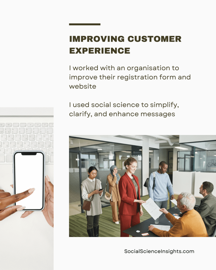
- I worked with an organisation to improve their service registration form and website
- I suggested behavioural solutions to simplify the registration form. This includes optimising it for mobile, making the questions easier to read and action, and clarifying requirements
- I also provided advice on enhancing the organisation’s service webpage. This includes a call to action, appealing to client motivations and expectations, making registration more attractive, and using an influential messenger
- My advice draws on social science theories on user design and customer experience, as well as social science methods of evaluating information, content themes, language, and images.

Background
How can we encourage customers and clients to sign-up to beneficial programs? Most businesses rely on their websites to provide information on their services, and they will offer online registration in an effort to recruit more people. Yet many organisations underestimate the importance of how information is presented, and the extra effort they force on the public due to poor layout and time-consuming design features.
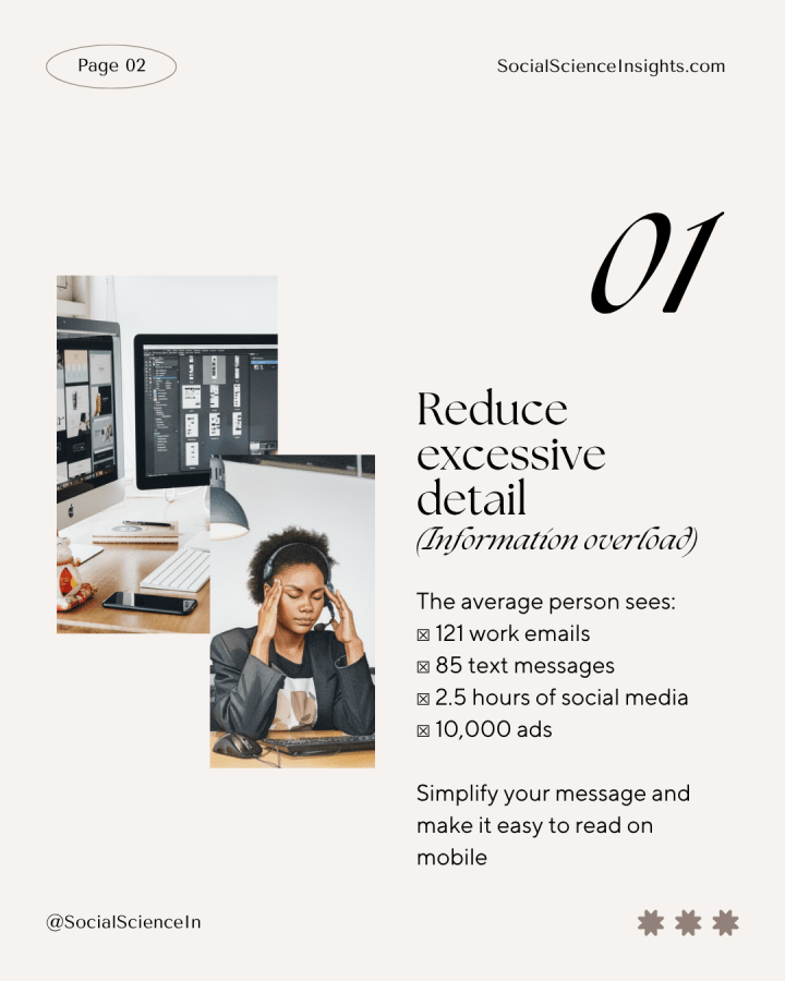
Every day, the average person receives 121 work emails and up to 85 text messages. We also spend an average of 2.5 hours on social media, and we are exposed to up to 10,000 ads through media and incidental advertising, such as on public transport, billboards, and even public toilets.
Businesses rely on advertising, social media, email, SMS and other communications to attract customers. They do not factor in people’s low willingness to go back to a message later, or to prioritise new decisions under a barrage thousands of messages vying for their attention.
Information overload
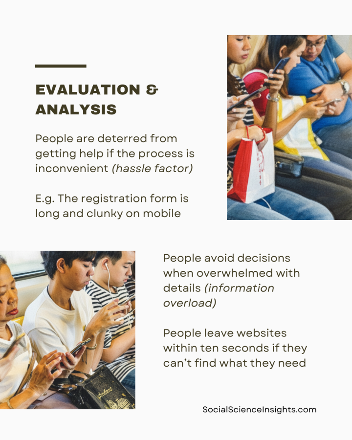
Even at the best of times, people have trouble taking in large chunks of information. Moreover, digital technology has increased the volume of information we receive, making it less likely we will effectively use information when considering complex decisions, or new actions (information overload).
There are both direct and indirect costs to our interactions with organisations and systems, which impact our productivity (friction costs). Small details that require extra effort or time add up, and have a hidden value—our time. This includes reading a lot of information, or clicking multiple times to complete a transaction. Even one extra step that makes a task more challenging or time consuming leads people to put off completion.
Websites must therefore be easy to navigate. Most people bounce away from websites within ten seconds, especially if they cannot quickly find what they need.
To compensate for the demands on our attention and off-putting frictions, any piece of communication—including text messages, forms, and webpages—should be easy to read, by breaking up and shortening details. Simplifying the design and layout of information, and reducing repetition improves responses and take-up of programs (simplification).
For example, short passages, checklists and bullet points on a webpage make the information memorable and actionable.
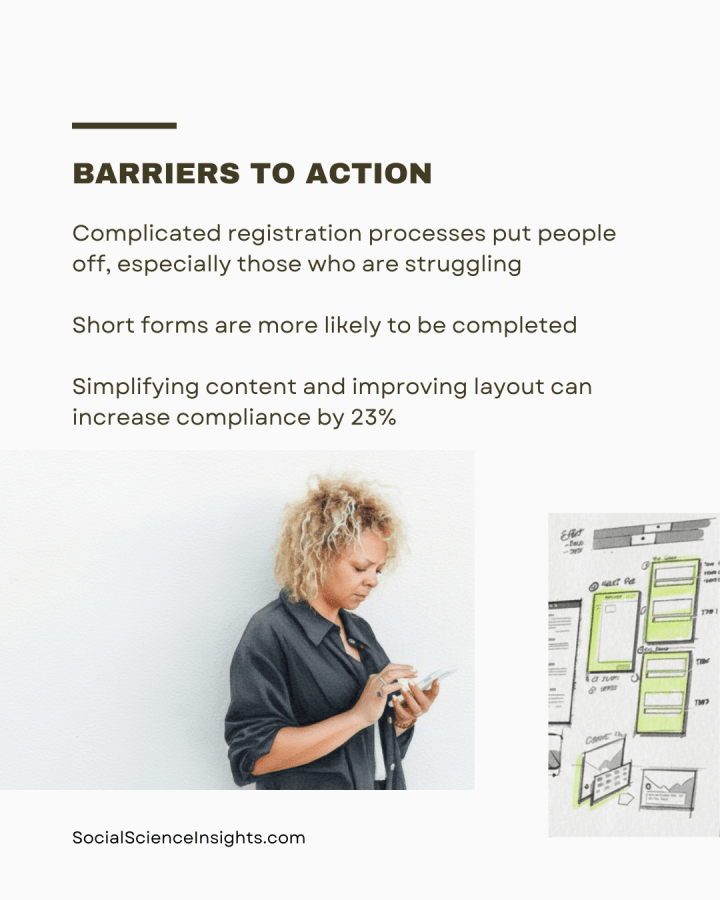
Keeping forms simple can also increase completion. A study found that simplifying a letter, by shortening content, keeping only relevant information, and improving the layout, increased tax compliance by 23%.
Scarcity mindset
When people are overwhelmed, time-poor, or financially unstable, they struggle with complex tasks, and discount new opportunities (scarcity mindset).
While it sounds intuitive, complicated registration processes put people off, especially vulnerable people who are struggling. However, service providers often fail to recognise flaws in their registration forms.
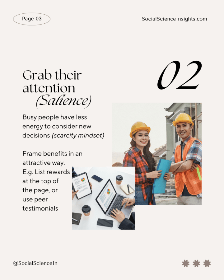
People are more likely to notice, correctly remember, and act on information based on the prominence of sensory details (salience bias). That is, the design elements that stand out, especially visual elements, such as bright colours, flashing text, loud sounds, novel presentation, personal relevance, emotional appeals, and the order in which they receive information. Highlighting incentives or rewards, appealing to motivations, and a clear call to action are all effective ways to attract attention.
For example, the benefits of a service should be at the top of a webpage, rather than forcing people to wade through less pressing details, and the layout should be easy to navigate on phone.
An influential person, especially an expert or peer who shares traits of our intended audience, can also cut through the noise (messenger effect). The right messenger can increase people’s willingness to trust and act on information. People are more likely to change their behaviour if they hear from warm and charismatic people who are ‘like them.’
Similarly, providing information about social expectations encourages change, such as showing how most people think we should act in a given situation, or how most people would sanction bad behaviour(social norms). This is especially effective when it shows social approval, or provides a benchmark in relation to peers or people in their local area.
Time pressure
Time pressure has a significant impact on our decision-making. It makes it hard to concentrate or switch between tasks, it can drain our memory and effort, and stop us from performing at our best.
People often value their time in ways comparable to other goods and services. Unlike money, time is a precious and scarce resource because it’s difficult to transfer or exchange. That is, when we lose time, it’s hard to gain it back. When things take too long, we are put off from finishing.
For example, forms that take a long time are less likely to be completed, while shorter surveys that take less than 20 minutes are more likely to be completed. Having run many program and service projects, however, I suggest that a good rule of thumb is to aim for five minutes or less completion time.
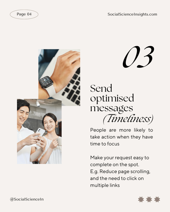
Time can be used to great effect, such as getting a brief and helpful message at the right time, showing the immediate costs and benefits, and helping people to plan ahead (timeliness). Timely prompts, such as SMS reminders, are most effective when people can complete the desired action quickly, at the time they receive the message.

What we did
I previously discussed my advice to Employment Advocate,* an agency seeking to improve take-up of their Employment Register. This free service matches clients with willing employers seeking new staff.
Previously, Employment Advocate sent their clients a SMS with a link to their general website, encouraging them to join the Register. Last time, I showed that the new messages should link directly to the registration form, and I outlined new SMS messages to encourage sign-up.
Employment Advocate wanted additional advice about improving the registration form and making their service webpage more attractive.
How we did it
First, I evaluated Employment Advocate’s registration process and identified ways to improve the customer experience. Second, I conducted content analysis of the Employment Register webpage.
Evaluation
My analysis shows the registration form is too long and clunky to fill out on mobile. The form is hard to read and complete on phone. Since the form is being sent via SMS, people may be busy, or on the go in a public place. The form needs to be straight-forward to complete on the spot.
People are deterred from getting help or completing a desired outcome if the process is inconvenient (hassle factor). For example, if there are too many unnecessary questions on a form, or if the sign-up process is confusing, or if the effort seems unwarranted. A registration form or webpage must therefore be simplified and optimised for mobile.

Content analysis
This webpage includes a lot of information about the organisation and their various programs (information overload). Clients must scroll over a clunky list of services, a huge and unrelated photo in the centre, and skim over repetitive information.
The link to the Employment Registration form is buried lower on the webpage, among other links. This forces clients to tread irrelevant information when they are already overwhelmed (scarcity mindset). They must also click on multiple links before reaching the form (friction costs).

What we found
My evaluation identified two opportunities for improvement: simplifying the registration form, and enhancing the service webpage.
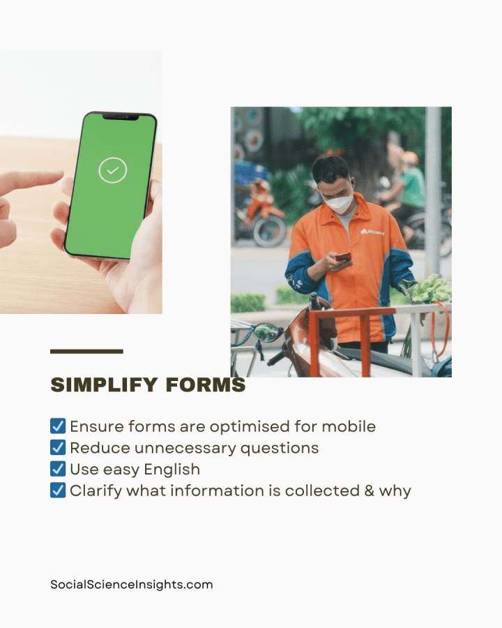
Simplifying the registration form
Stop information overload. First, I provided advice on removing unnecessary steps from the registration form (simplification).
- To make the registration form mobile-accessible, the layout should be optimised for mobile.
- The current registration form is hard to read and complete. The questions are centred, meaning you have to pinch the screen on mobile, and move the page around to read the text. Text should be aligned left for easy reading.
- Users must select their location from a list of tick boxes, but these are difficult to read, and some of the options are cut off on mobile screens. Lists and multiple choice questions should be brief and easy to select.
- There are too many irrelevant and repetitive questions. For example, people’s middle name and mailing address are required, and two questions require a contact number as well as a mobile number. Reduce unnecessary questions, including those not required to provide the service.
To make the form easier to complete, use easy English. That is, language that can be easily understood, with everyday words, and simple sentences.
- Various questions are unclear. (E.g. ‘What level are you in your training? Are you at the same level for your formal training?’) Keep the wording simple and relevant to the registration.
- The form includes questions asking clients to recount what went wrong with their previous employer, and why they did not seek help earlier. It is unclear how this relates to the service. People who are overwhelmed don’t want to be reminded of failure. Only include questions directly used to deliver services, in this case, matching skills and qualifications with employers.
- The form includes an informed consent tick-box that reads like legal jargon. This may scare off clients. Clearly describe what information is being collected, why, and what is shared with third parties (such as employers). E.g. We do not share your contact information with employers unless you agree to a job match. Do you agree that we can call you about relevant job opportunities?

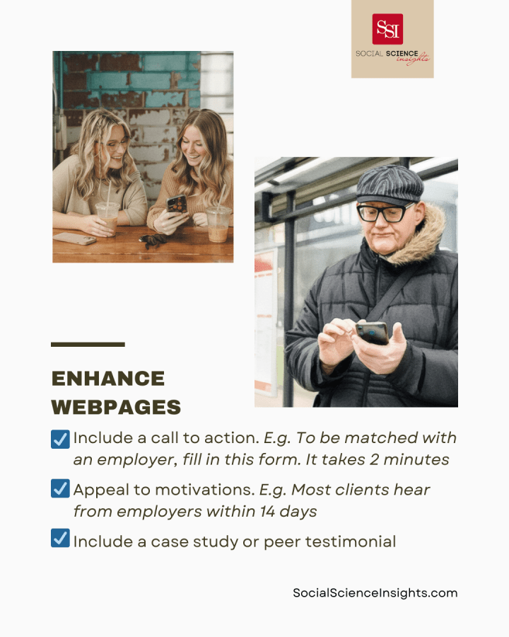
Enhancing the service webpage
Alleviate scarcity mindset. The current webpage lists the benefits of the service (such as financial support) and the link to the Employment Registration form at the bottom of the page.
People can be incentivised to take-up services when the benefits are immediately clear (salience bias). I suggest reorganising information so that what’s most relevant is at the top.
- Appeal to motivations (social norms): Set expectations about the service that align with the clients’ needs, such as a quick response from employers. E.g. Most clients hear from employers within 14 days
- Make registration appealing (salience bias): Include information about financial assistance up front, such as at the top of the webpage. Emphasise that employers are keen for new hires. E.g. We can provide $2,500 in financial assistance. We have 500 employers across many industries eager to meet you
- Use the power of social influence (messenger effect): Include a short case study or testimonial from a client who signed up to the Employment Register, and a photo. Show how quickly they were matched with a great employer.
Reduce time pressure. The current webpage includes multiple summaries of the Employment Register. Show that the customer’s time is valued. Prompts to sign-up should be timely and easy to action.
- Make it quick and easy to act (timely): Include the registration form link at the top of the webpage, with a call to action. Tell them what they have to do and how. E.g. To be matched with an employer, fill in this form. It only takes two minutes: https://bit.ly/EmployRegister
- Simplify information (simplification): Reduce repetition, and the need to scroll through too much information, or to click multiple times to find relevant services. Describe the service once, in easy English. Provide a link to the service registration form up top.

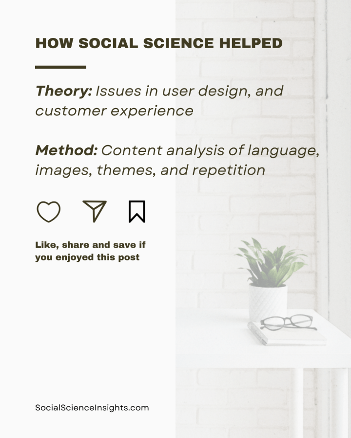
How Social Science Helped
Social science theory: I used social science literature to identify issues in user design of webpages, and ways to enhance customer experience.
Social science method: I used content analysis to identify patterns in the form and webpage design. For example, I demonstrated use of language, images, recurring themes, repetition, and navigation.
Tips:
- Reduce detail: Keep forms and webpages short
- Use simple language so information is easy to read
- Don’t ask for irrelevant information. That is, details that won’t be used to deliver services
- Reduce the number of questions on forms, ideally ten or less, including demographics
- Grab attention: Frame benefits in an attractive way
- Show rewards at the top of the form or webpage
- Use a trusted messenger
- Send optimised messages: Make your request easy to complete on the spot
- Use a quick and easy call to action
- Make forms and websites mobile-friendly, by optimising layout and making completion easy to use on touch screens
- Reduce the need to scroll or click multiple times
Notes
*Employment Advocate is a pseudonym.
